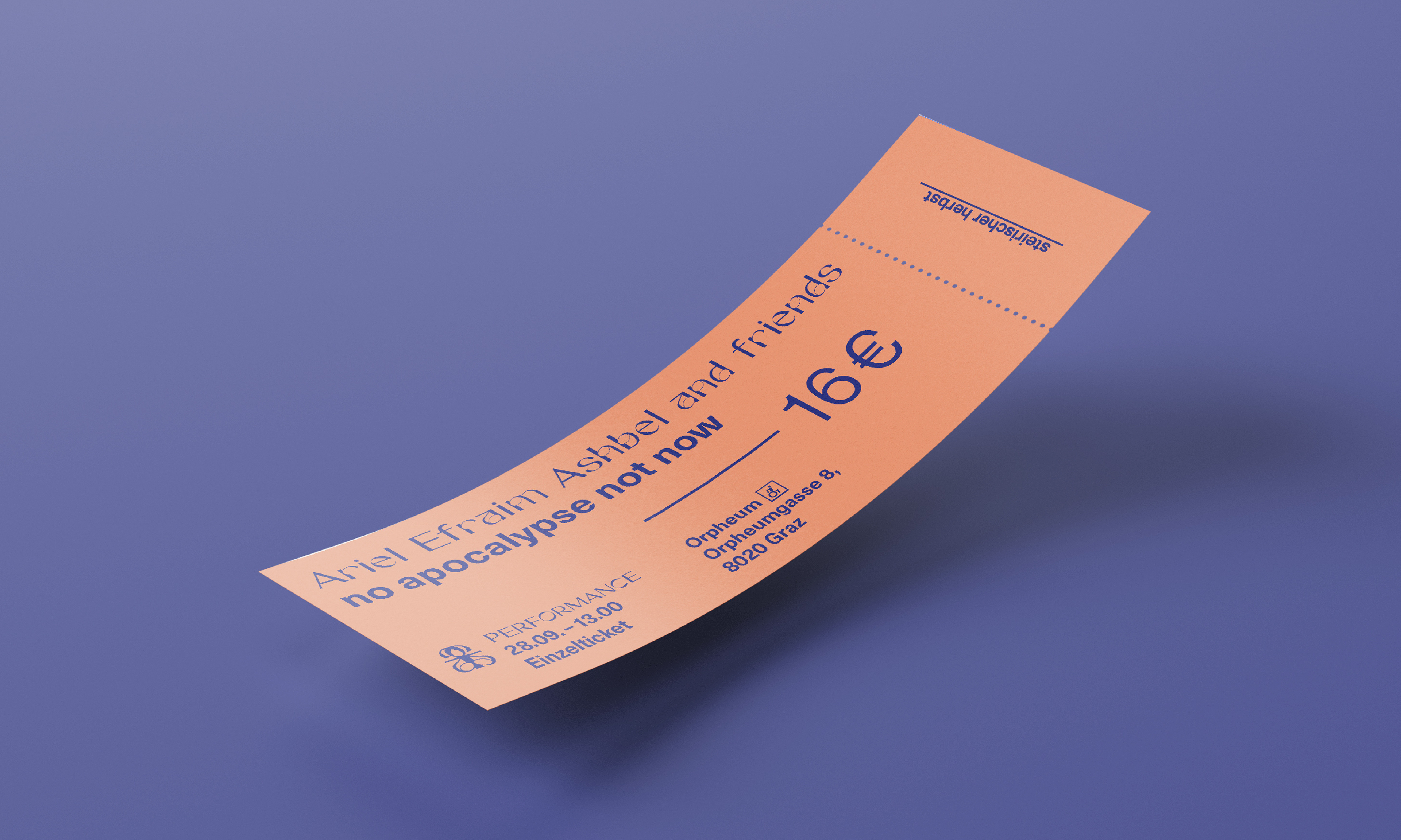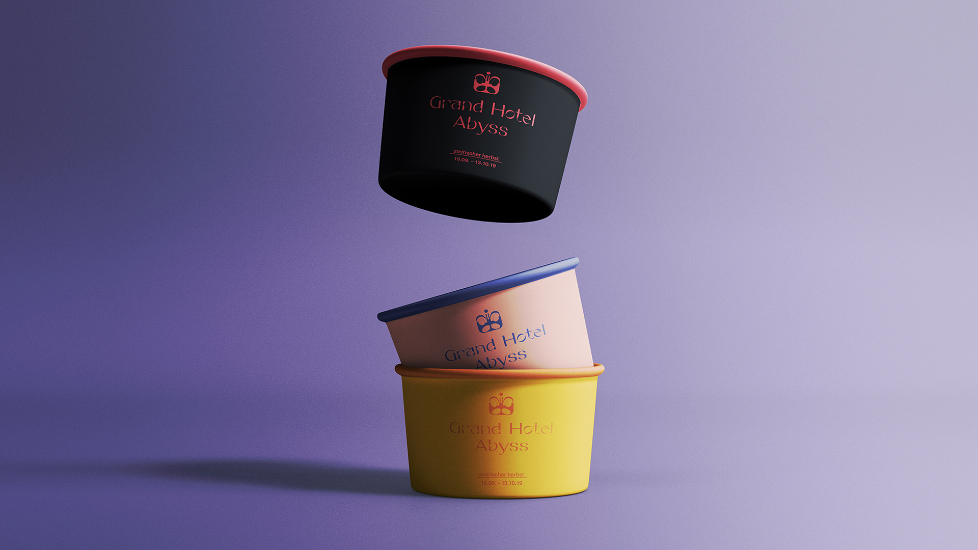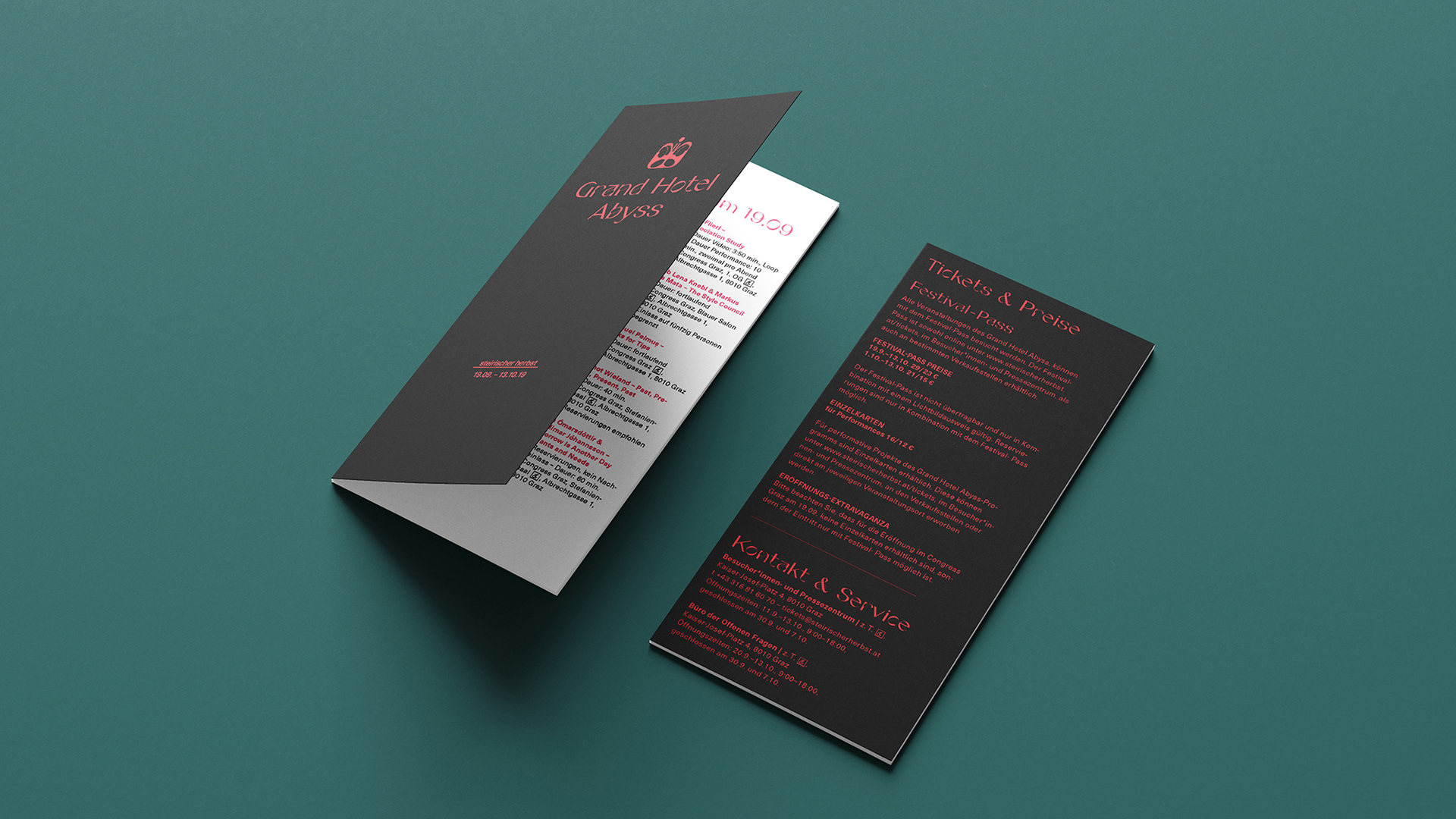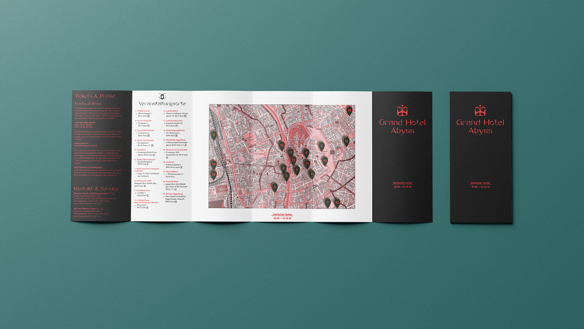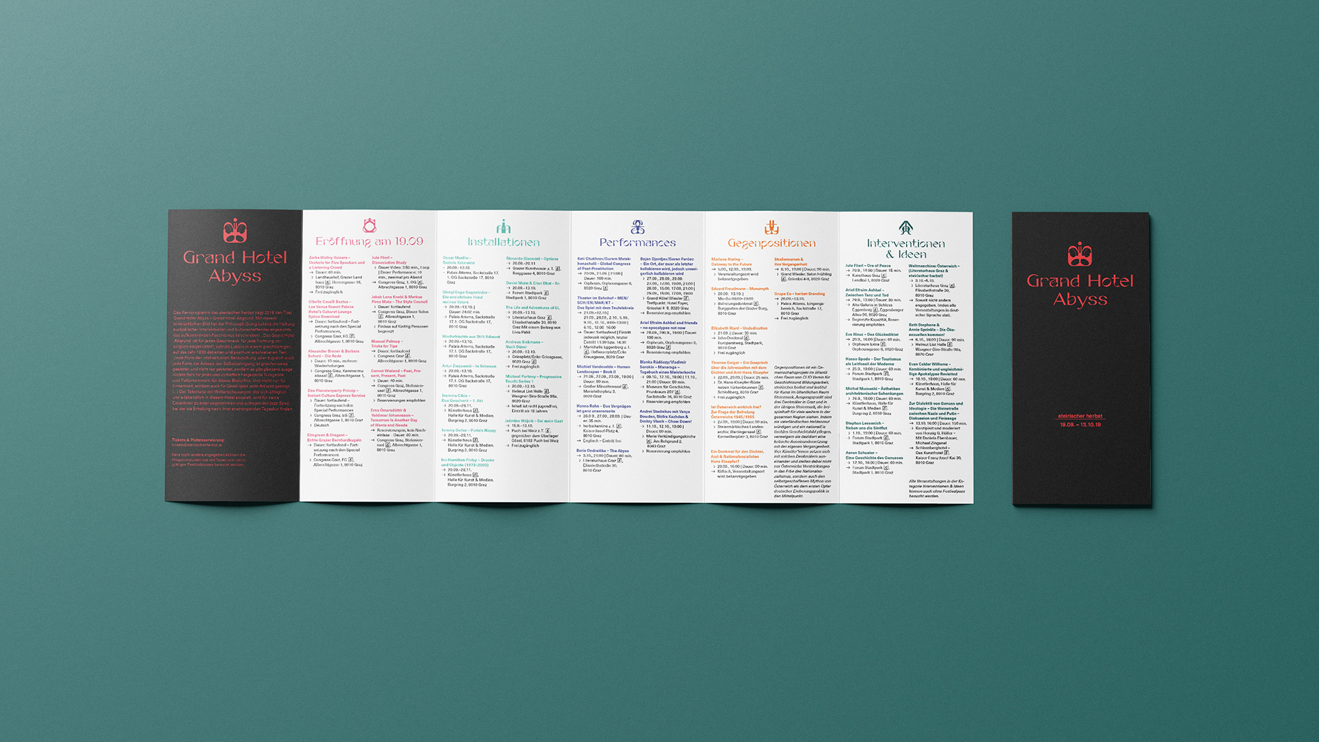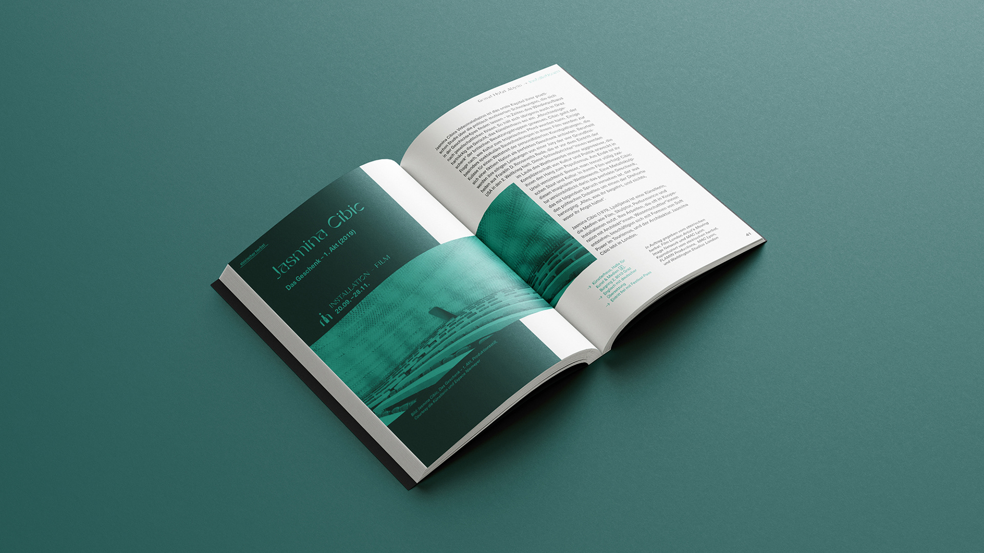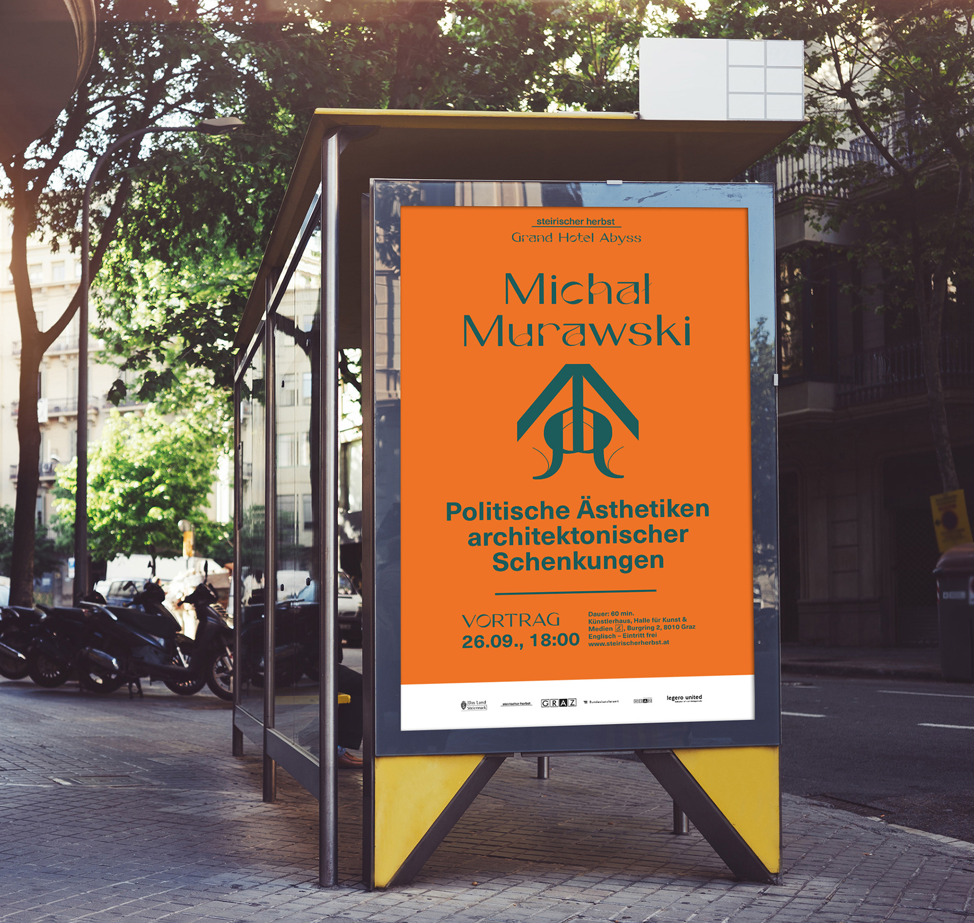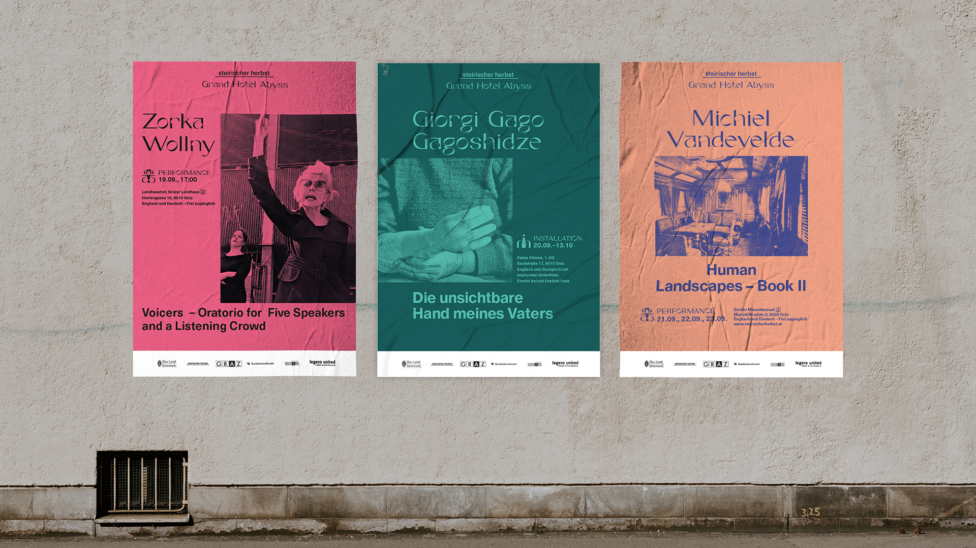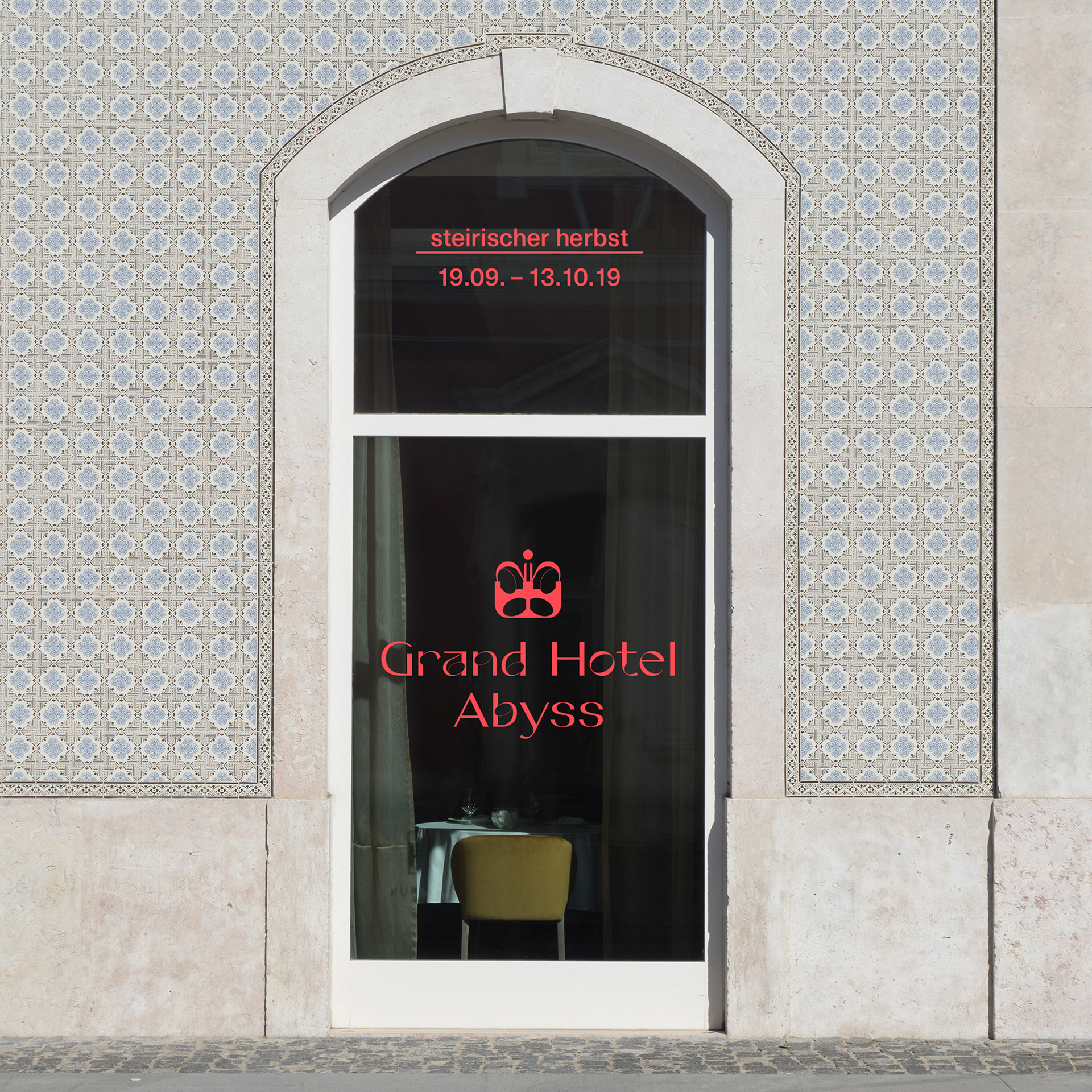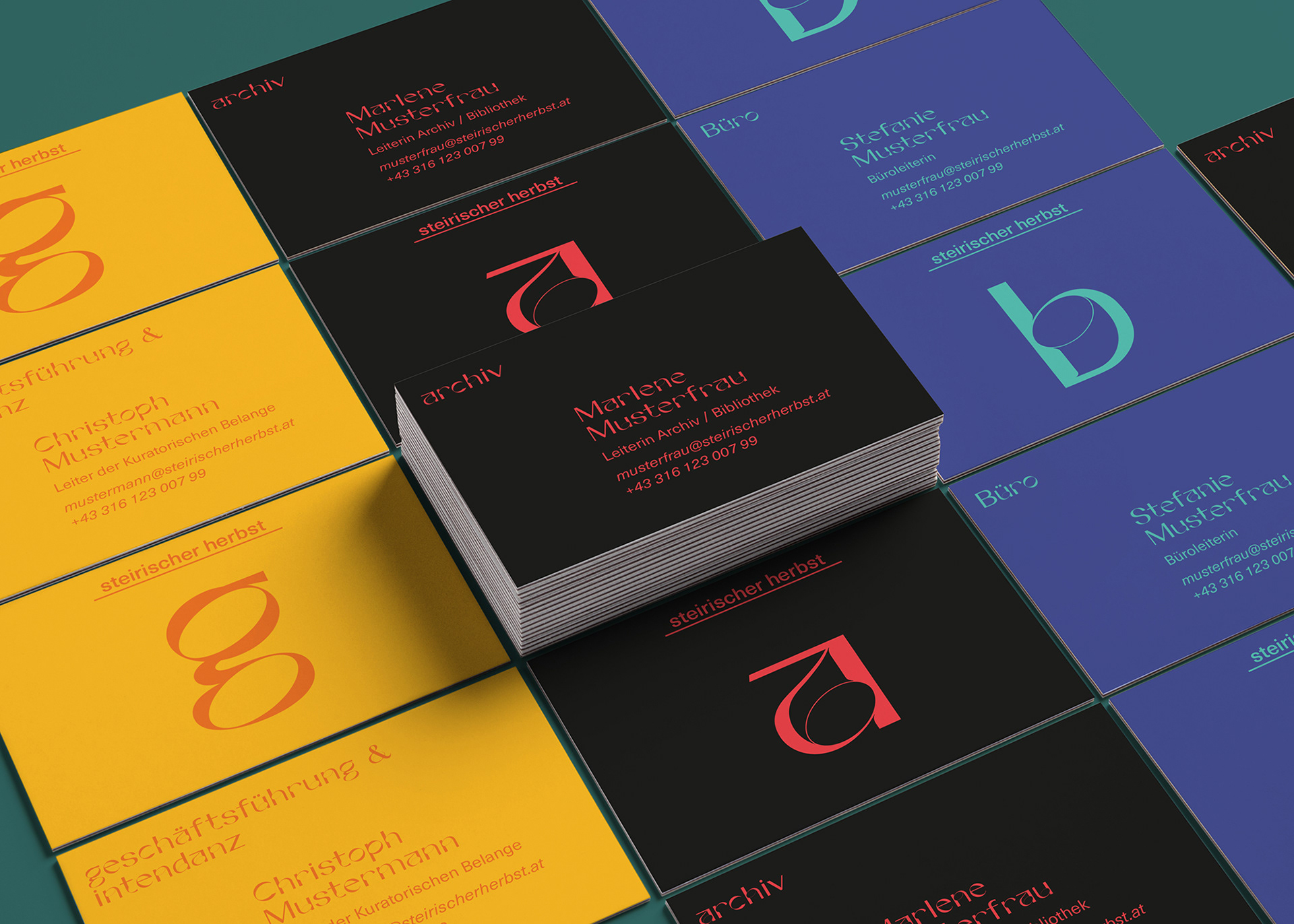

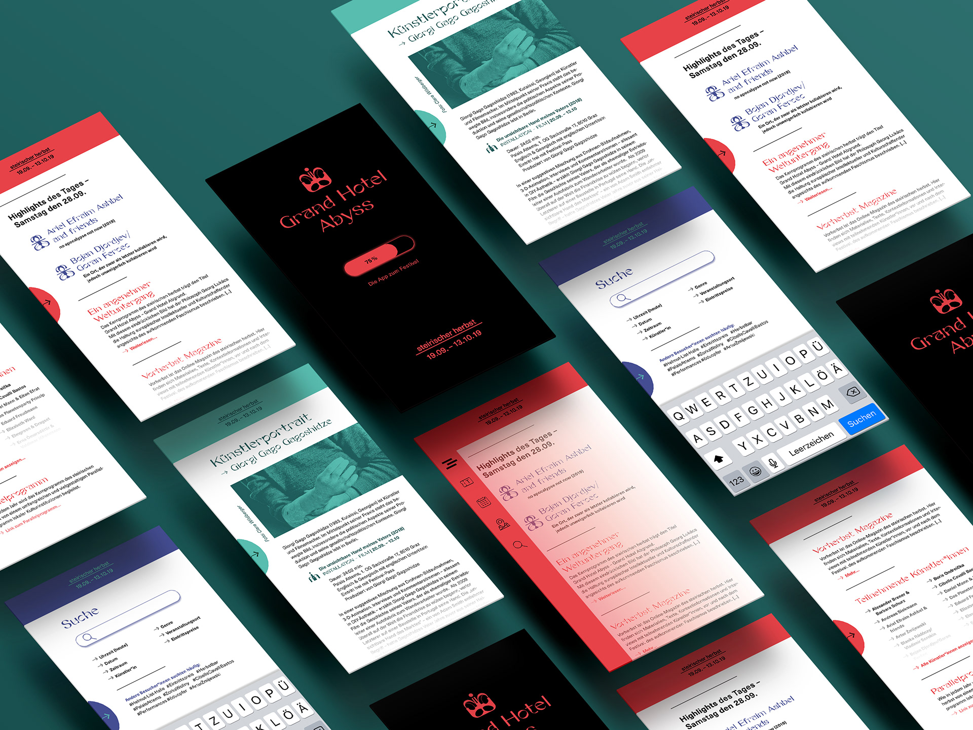
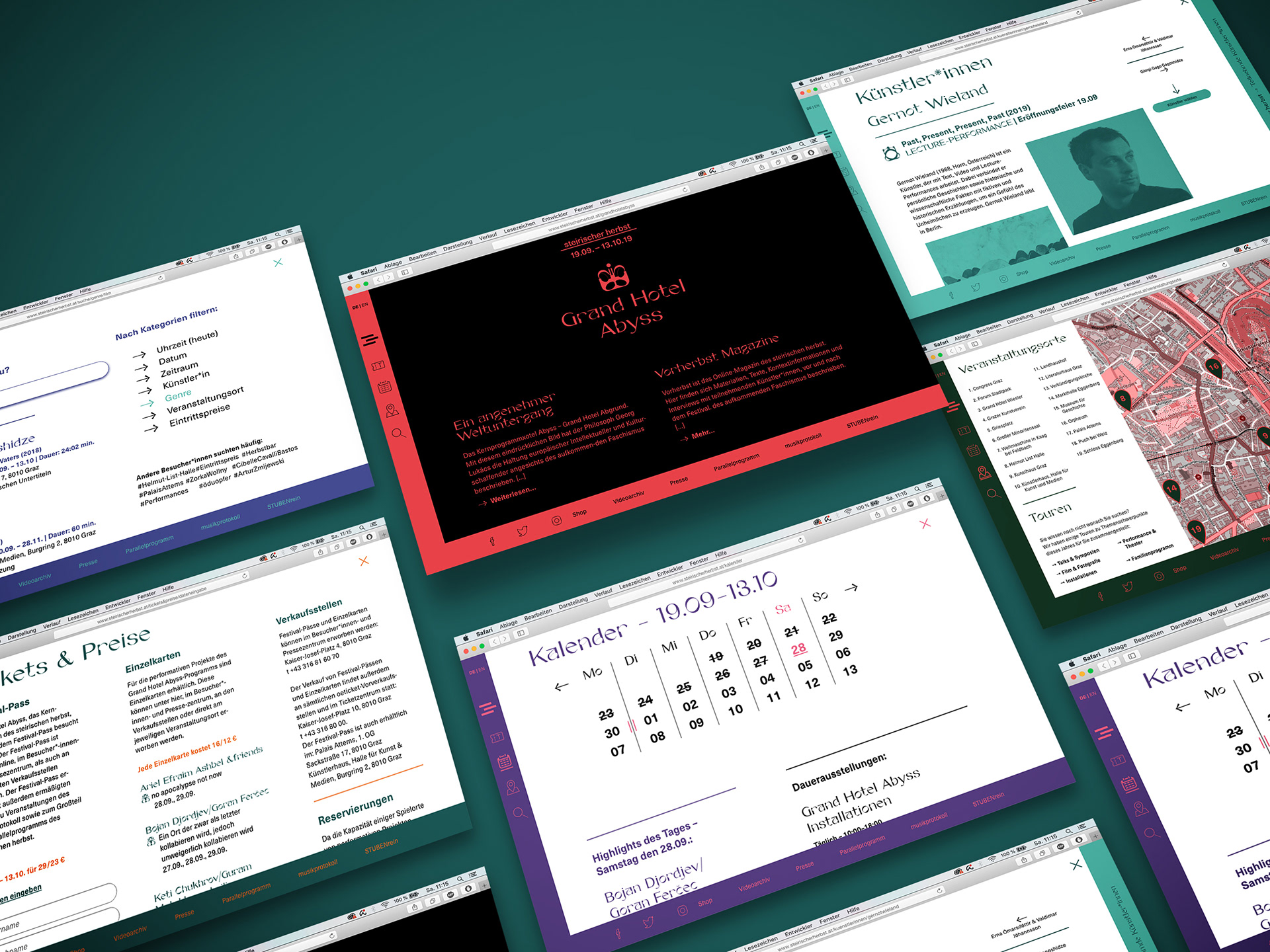
Nora Kaszanyi's striking Gaia is used as basis for the decisive look-and-feel which ultimately resulted in section-specific icons and symbols for the festival. Unique color-combinations are also used as easily accessible marking-sections throughout the branding, providing the reader with easy to understand hints in which sections he is currently reading, while also displaying different information. One of the main goals of the work was to establish a clear information hierarchy, which is also visually pleasing to the attendants.